Overview
A fresh take on a cult favorite
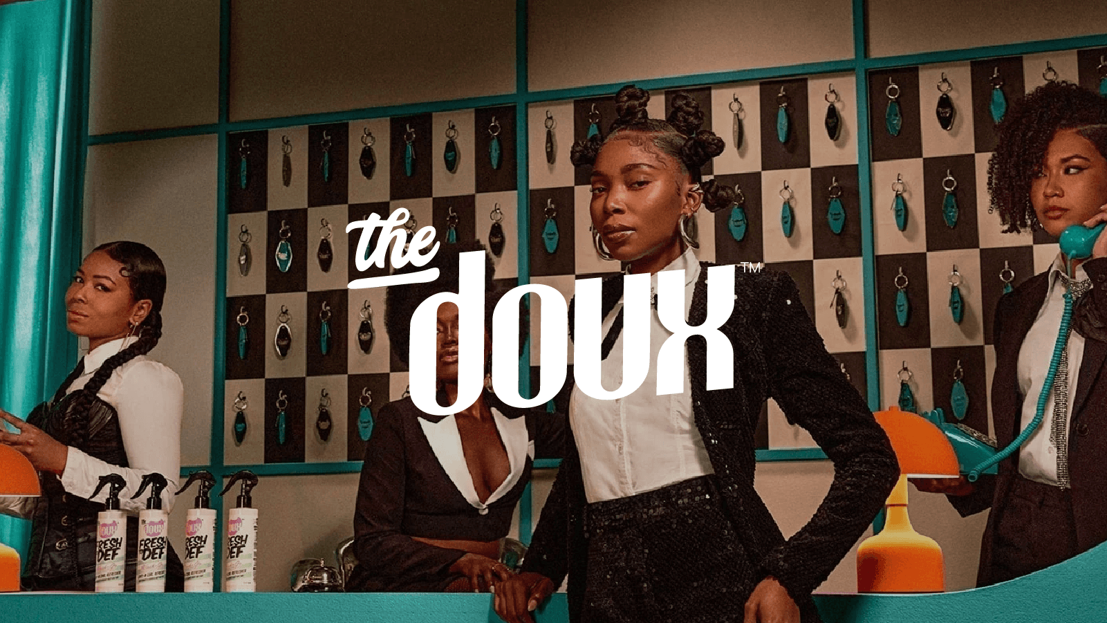
The Doux is a cult-favorite textured haircare brand known for its high-performing formulas, hip-hop nostalgia, and bold personality.
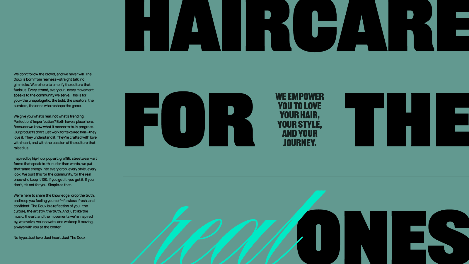
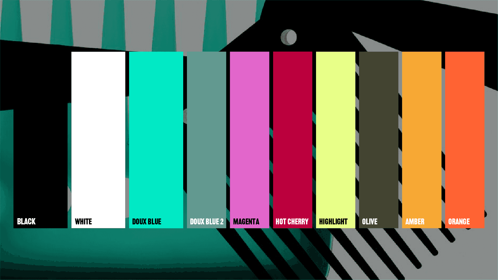
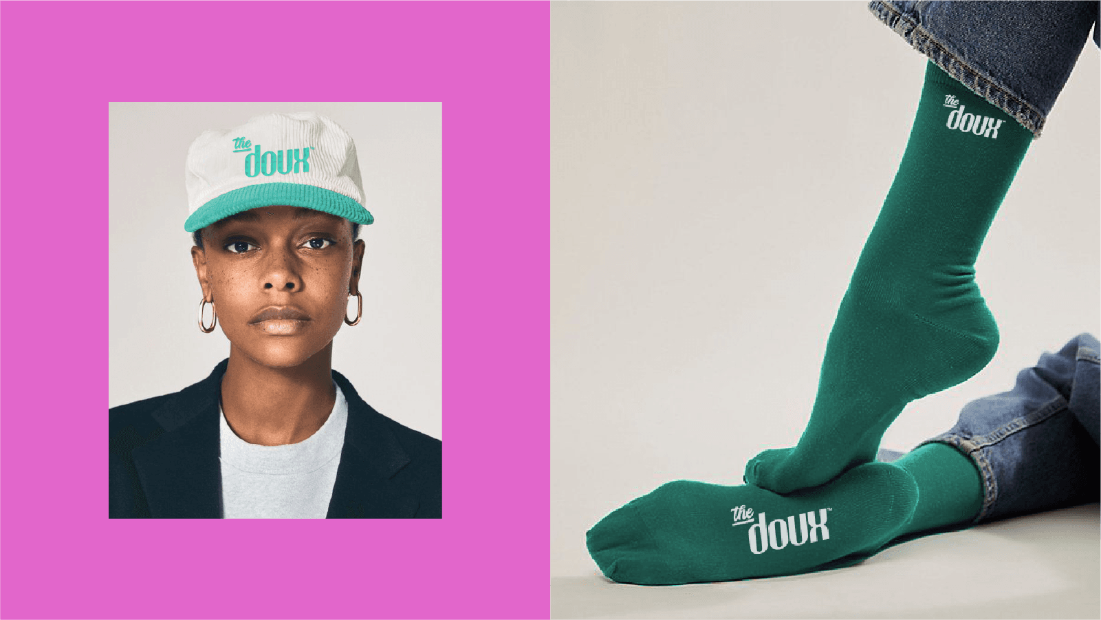
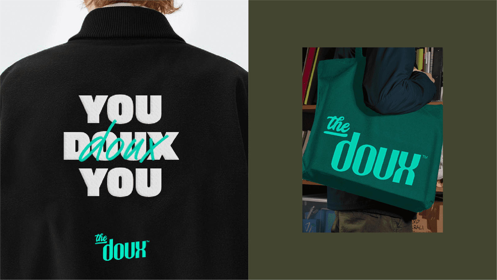
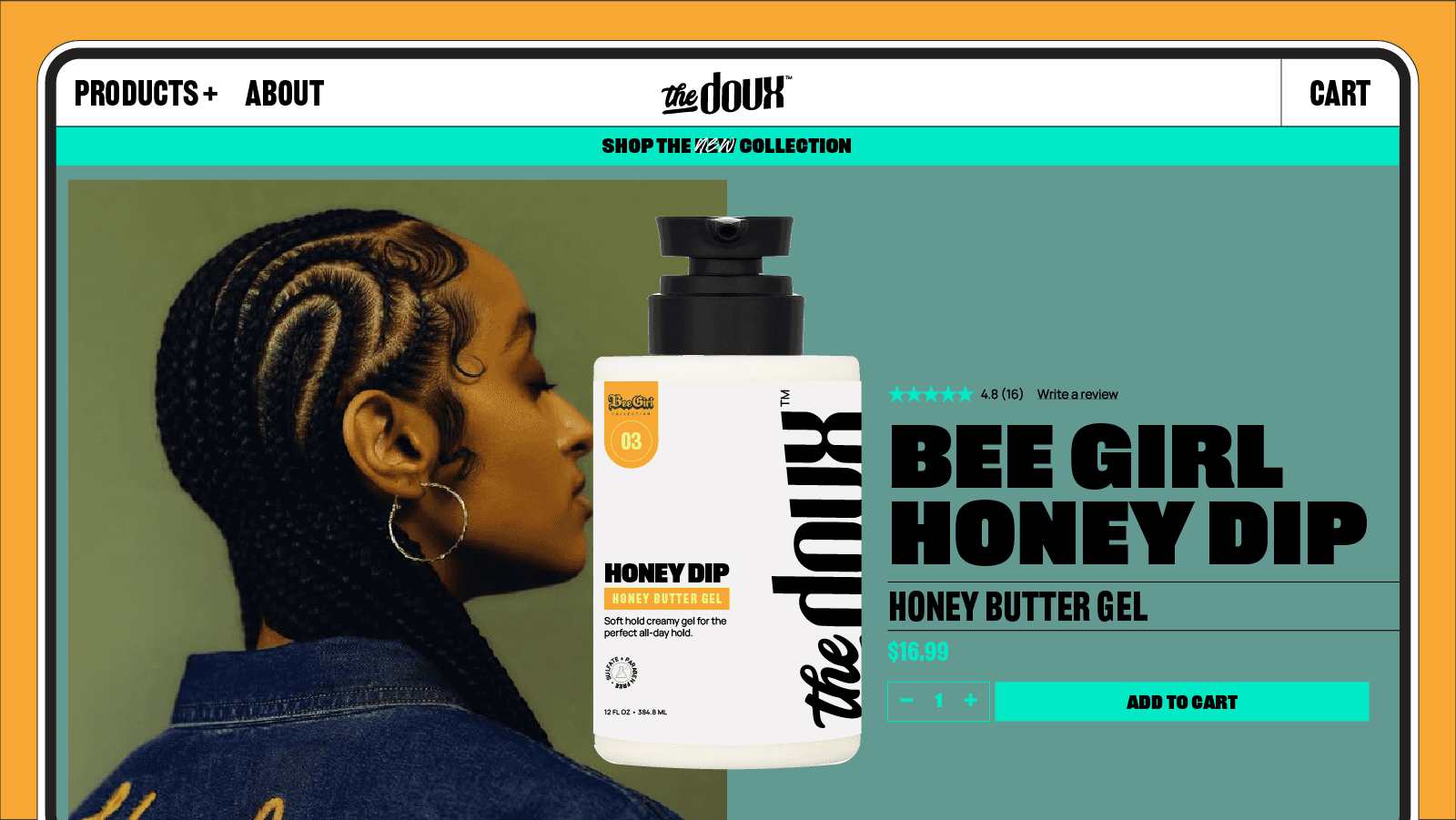
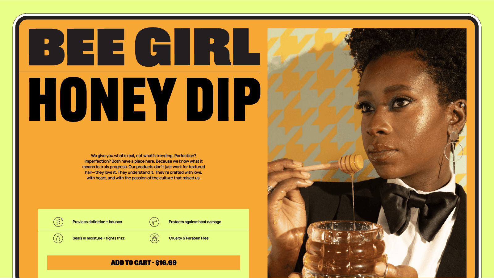
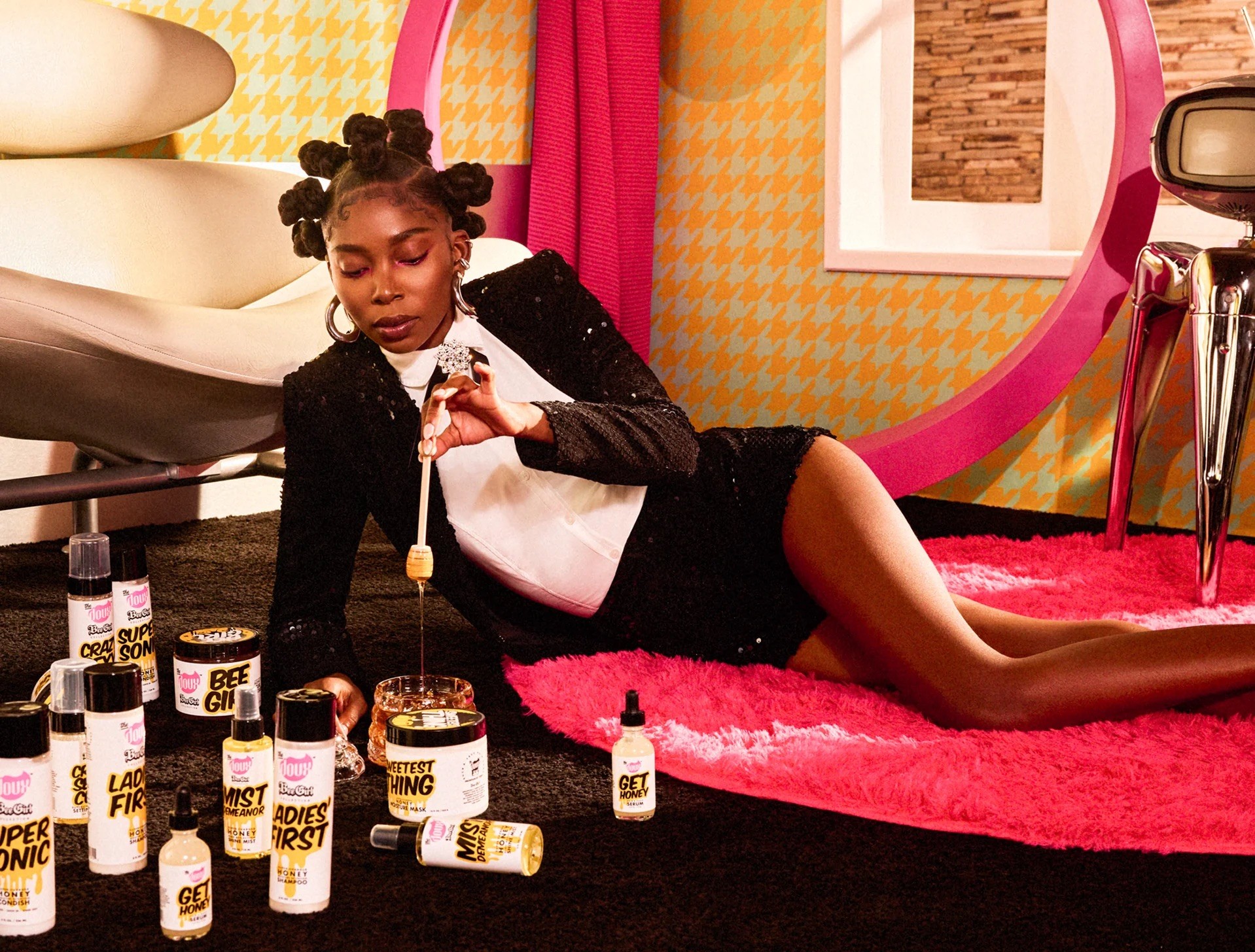
With plans for bold, editorial-led campaigns and new product launches, The Doux aimed to evolve its brand identity and maintain the core identity while making room for more expressive storytelling. Building on the foundation of the brand's Chateau La Doux campaign visuals, I updated the logo by removing the swoosh around 'Doux' and sharpening the glyphs for a cleaner, more contemporary look. Pulling directly from the current product packaging, I updated and expanded the color palette, giving the system more cohesion across print and digital. Thick and bold sans serif typography created a consistent yet adaptable system, allowing typeface changes from campaign to campaign. The refreshed identity gave The Doux a modernized foundation that still felt loud, confident, and unmistakably The Doux.
Note: This design direction was approved and passed off to the client, but implementation is at the brand’s discretion and has not yet occurred.