
Teneral Cellars
Teneral Cellars is a DTC e-commerce wine brand that gives back to equitable organizations. The brand was looking for updated branding, illustrations, and assets as well as a website refresh to help users navigate the site more easily.
Project Deliverables: Brand Identity, UI/UX
Project Type: Client
Role: Lead Designer
Designed: 2022
Colors
Illustrations
Assets
UI/UX
The Process • The Process • The Process • The Process • The Process • The Process
Understanding the Problem
Teneral Cellars wanted to refresh the brand with bold colors and swap out the primarily pink palette for trendy colors. The brand wanted to keep the original deep burgundy and incorporate other colors to stand out from other wine brands.
The brand also wanted to create a personal feel with a variety of hand-drawn illustrations that could be used across digital and print platforms.
Creating a Solution
After researching other wine and beverage brands, I gave the brand an electric palette that paired well with the original deep burgundy but was very unique in the market.
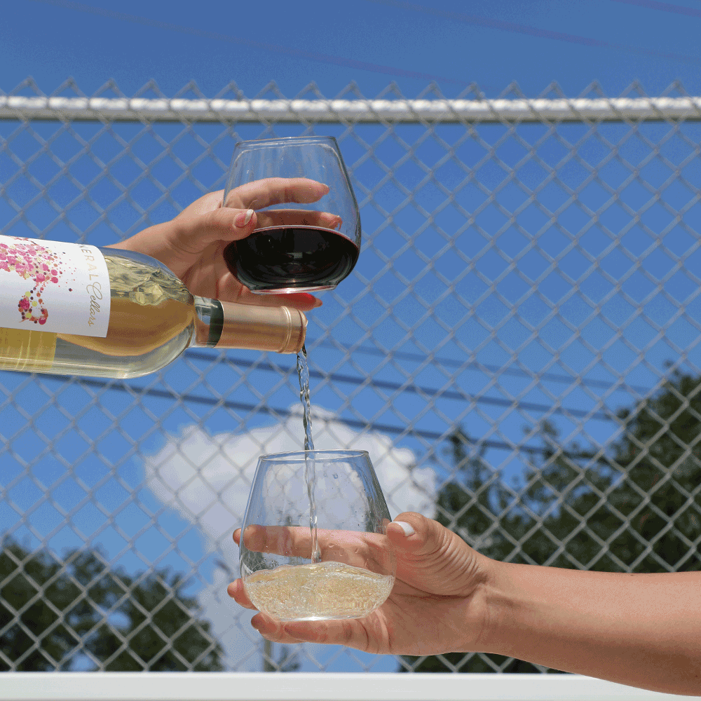
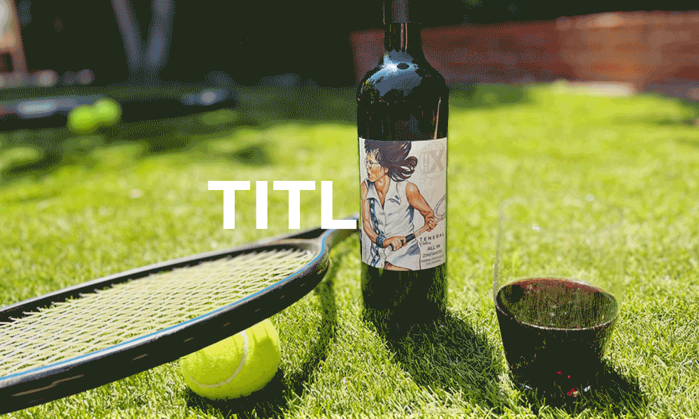
I also digitally illustrated a variety of illustrations that would resonate with the target audience and boost brand recognition.
Putting it all Together
Teneral Cellar's new color palette is fresh and youthful in the wine space and makes the bottles pop on colored backgrounds. The custom illustrations give the brand a personable feel and increases recognition across digital and print assets.
Branding • Branding • Branding • Branding • Branding • Branding • Branding
To reflect the brand's sustainable and eco-friendly initiatives, I added a blue and green into the palette
Rounding out the palette, a soft white pairs well with all the colors
Wanting to create a contrast with the wine colors, I gave the brand a vibrant orange
To give the brand more flexibility, I added 2 more wine colors that could be paired with the original burgundy
Colors
OG WINE
Sweet WINE
Rosé
Mouthfeel
White Wine
Grapevine
Sipworthy
Illustrations • Illustrations • Illustrations • Illustrations • Illustrations


Assets • Assets • Assets • Assets • Assets • Assets • Assets • Assets • Assets • Assets
Branded E-Gift Cards
I gave Teneral Cellar's digital gift cards a facelift by utilizing the new color palette and wine illustrations.


Email Graphics
To boost the brand's reach and connect with new and returning customers, I created 50+ static and animated email graphics around promotions, new wine collections, and wine clubs.
UI/UX • UI/UX • UI/UX • UI/UX • UI/UX • UI/UX • UI/UX • UI/UX • UI/UX • UI/UX • UI/UX • UI/UX • UI/UX
Understanding the Problem
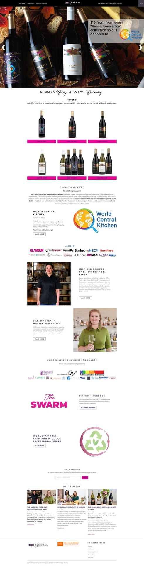
Teneral Cellars’s original website was cluttered, unorganized, difficult to navigate, and very pink. The brand needed a user-friendly responsive website refresh to create consistent messaging and boost sales.
The brand was already using Shopify and had built out an extensive product list, so I worked with the Teneral Cellars team to modify and edit landing pages.
Findings of Objective 1
The first key objective was discovering how Teneral Cellars could highlight giveback initiatives and position the brand differently in the market. I found that placing a mission statement and values on the homepage would immediately inform users about a brand’s initiatives and encourage users to interact with and support the brand.
Findings of Objective 2
Findings of Objective 3
Question
The second key objective was exploring how to encourage users to purchase products. Findings included placing the shop page as the first link in the main navigation, adding featured products under the fold on the homepage, and placing product calls-to-action in highly visible areas.
The third key objective was finding the best place for quarterly wine collection releases and campaigns. I found that placing new products in high traffic areas, such as right under the fold on the homepage, would increase awareness.
How could we promote the brand's initiative around equitability and encourage people to purchase wine?
Ideation • Ideation • Ideation • Ideation • Ideation • Ideation • Ideation • Ideation
Home
Shop
Wine Club
Blog
About
All Wines
Wine Tastings
Gifting
Simplifying the main navigation menu reduced confusion and drove users to the shop page

The Old, Tired Website was replaced with a fresh look and feel
Solution • Solution • Solution • Solution • Solution • Solution • Solution • Solution


Solution
By streamlining the site map and creating consistent branding and messaging, Teneral Cellars now provides a user-friendly experience from browsing to checkout. By positioning the mission statement and products right under the fold on the homepage, brand awareness and sales have increased.

More Projects • More Projects • More Projects • More Projects • More Projects