The Challenge
Launching with just one product, Plum needed an e-commerce site that highlighted the science-backed effectiveness of the hero product, an innovative vaginal serum, while honoring its pharmacist-founded roots. The site needed to inform and educate consumers, build trust through expertise and credibility, and deliver a smooth checkout experience—all while exuding a premium, sophisticated aesthetic that effortlessly integrated with skincare and wellness routines to complement the audience’s lifestyle.
The Solution
As the lead product designer, I collaborated with the Plum team to craft a refined, interactive experience across seven key pages for responsive desktop and mobile screens—transforming complex scientific content into an elegant, user-friendly journey that informs and empowers viewers. The design integrates interactive modules and a sophisticated visual language to elevate user engagement, making it easier for consumers to understand and incorporate Plum’s groundbreaking vaginal serum into their daily routines.
The Process
Phase 1: Discovery + User Flows & Sitemap
Phase 2: Wireframing + Prototyping
Phase 3: Designs + Developer Handoff
The Challenge
Launching with just one product, Plum needed an e-commerce site that highlighted the science-backed effectiveness of the hero product, an innovative vaginal serum, while honoring its pharmacist-founded roots. The site needed to inform and educate consumers, build trust through expertise and credibility, and deliver a smooth checkout experience—all while exuding a premium, sophisticated aesthetic that effortlessly integrated with skincare and wellness routines to complement the audience’s lifestyle.
The Solution
Plum’s website is compact yet comprehensive, featuring six key pages: the homepage, Product Detail Page (PDP), The Science, Ingredients, The Research, and a blog. Each page was carefully designed to inform users about the groundbreaking vaginal serum while showcasing a refined, sophisticated aesthetic that inspires confidence and ease in incorporating the product into daily routines. Interactive modules were included to enhance the user experience, making the content more engaging and simplifying complex information. Overall, Plum's website seamlessly combines education, elegance, and user engagement, providing a platform that not only informs but also empowers consumers.

Phase 1
Discovery + User Flows & Sitemap
DIScovery
I explored a range of health and wellness websites focusing on reaching women in their 30s to 50s—many navigating hormonal changes due to perimenopause or menopause—who sought credible solutions without steroids or injections that aligned with their lifestyle.
User Flow
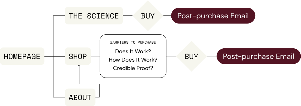
As a first-of-its-kind product on the market, I prioritized showcasing the science behind it, aiming to build a credible, expert-led experience that eased concerns and empowered users to make a confident, informed decision about a highly personal purchase.
Sitemap
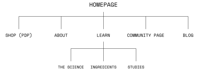
Designed to provide the information new consumers needed to make a purchase, the site featured seven key pages: the Homepage, Product Detail Page (PDP), The Science, Ingredients, The Research, Community (social proof + testimonials), and a blog.
30-50s
Jane
Hormonal changes
Lifestyle-aligned
Science-backed solution
excerpt of user flow
Phase 2
Wireframing + Prototyping
Wireframing
To educate consumers about this new product, I incorporated several interactive modules that transformed dense, science-focused content into digestible, engaging experiences. These modules were strategically integrated into key pages to simplify complex information and build credibility—helping users feel informed and confident in considering the product.
Prototyping
Helping visualize the user journey, I walked the client through several relevant real-world examples and developed interactive prototypes with click-throughs and animations to bring the wireframes to life—ensuring alignment and clarity before transitioning into high-fidelity designs, fostering a collaborative and efficient design process.
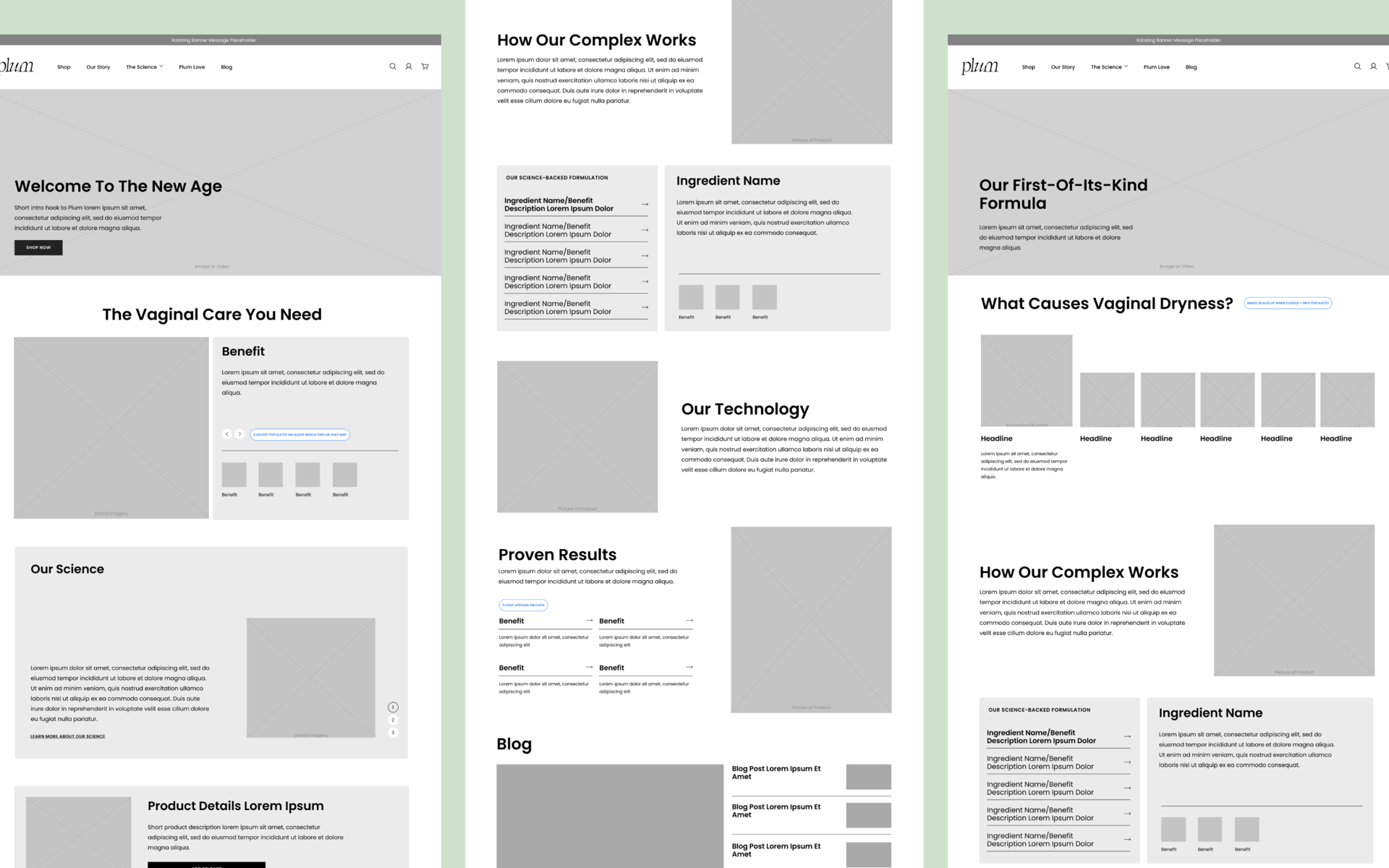
Phase 3
Designs + Developer Handoff
Designs
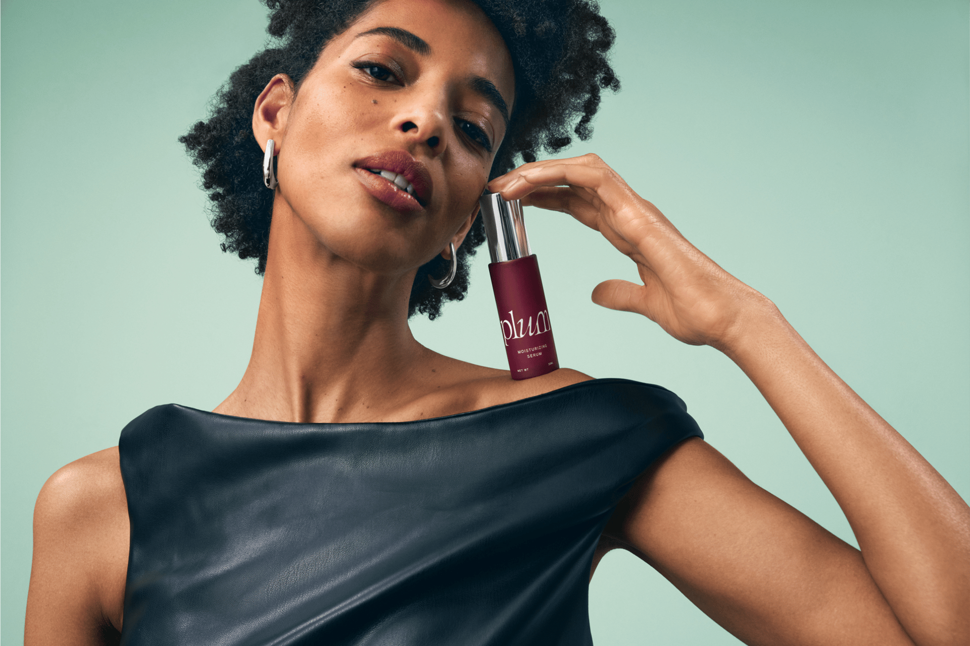
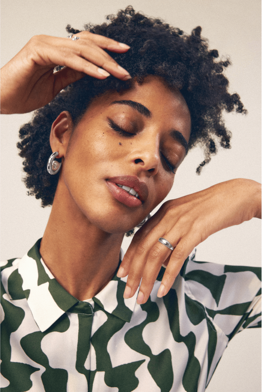
Drawing from the visual identity, I centered the website palette around soft mint and cream tones to evoke warmth and softness, while allowing the rich plum-colored packaging to stand out. A key element of the brand identity—the golden ratio—inspired the site’s layout, expressed through clean horizontal and vertical lines and white space to create a sense of elegance and airiness. To bring a tone of sophistication and confidence, I curated photography featuring confident models and beautiful product packaging.
Developer Handoff
Once the client approved the final designs, I prepared a comprehensive handoff package that included annotated design files, animation references, and a detailed style guide for the development team. I also walked them through the finalized visuals to ensure clarity and alignment. After the site is staged, I conducted an initial round of quality assurance—leveraging design review tools to flag and comment on any discrepancies—ensuring a pixel-perfect execution before the final handoff to the client.


Final Thoughts
By transforming complex, science-driven content into an elegant, approachable digital experience, I helped establish a credible and engaging brand for a first-of-its-kind wellness product. Every design decision—from interactive modules to color palette, layout, and imagery—was grounded in strategy and crafted to resonate with the target audience. The client’s enthusiasm for the visual direction extended beyond the website, leading us to move forward with a photoshoot, which I provided art direction for, using the reference imagery I curated during the design process. It was a rewarding end-to-end collaboration that brought the brand to life across both digital and visual storytelling.

