
Overview
Refocused and ready: a leaner, smarter site.
Mason, an established marketing and advertising agency, has years of experience and a growing portfolio of national clients.
Brought in midway through the project, I led the redesign from the wireframe stage, restructuring Mason’s content-heavy site into a clean, conversion-focused experience. My goal was to streamline dense sections for clarity, guide users toward essential information, and build clear calls to action into every page to support lead generation.

Step 1: Identifying the problem
Cutting through the clutter.
Mason’s original site was packed with valuable content, but its disorganized layout made navigation and engagement challenging. The agency's current clients noted that the experience felt overwhelming, signaling a need for clearer structure, more accessible content, and a design that allowed users to quickly grasp information without losing important context.
question
How might we simplify the navigation and structure content to highlight key information without overwhelming the user?
Step 2: Ideation & Exploration
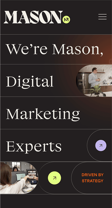
Streamlining the experience, elevating the flow.
Before moving into wireframes, I identified opportunities to streamline information, reduce visual clutter, and bring organization to the site, building upon:
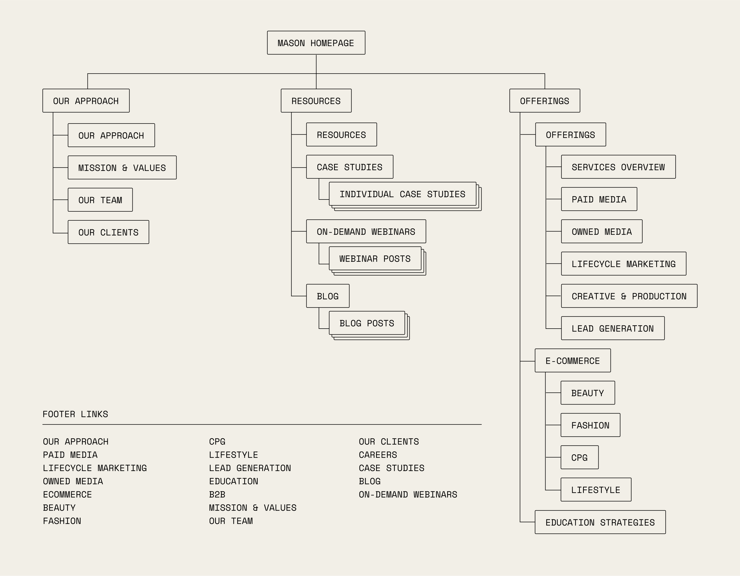
Redesigning site navigation for a smoother, more logical experience
Grouping related information together to reduce overload
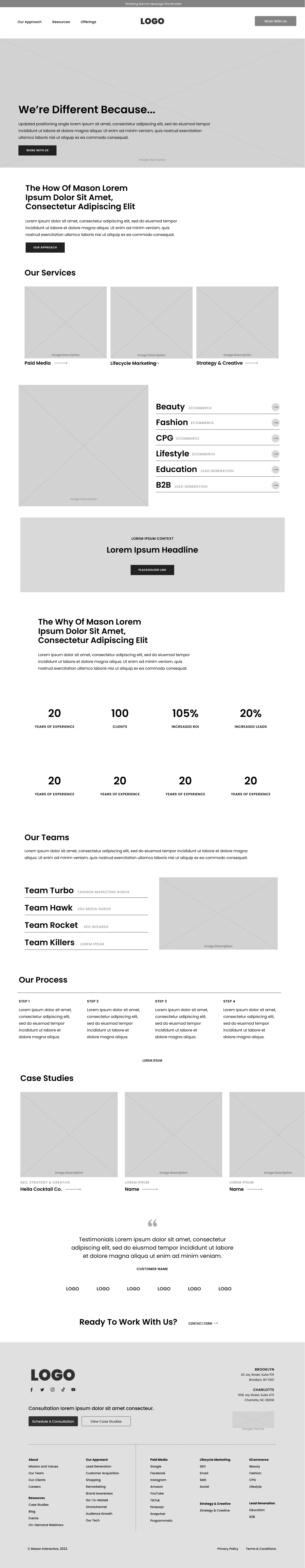
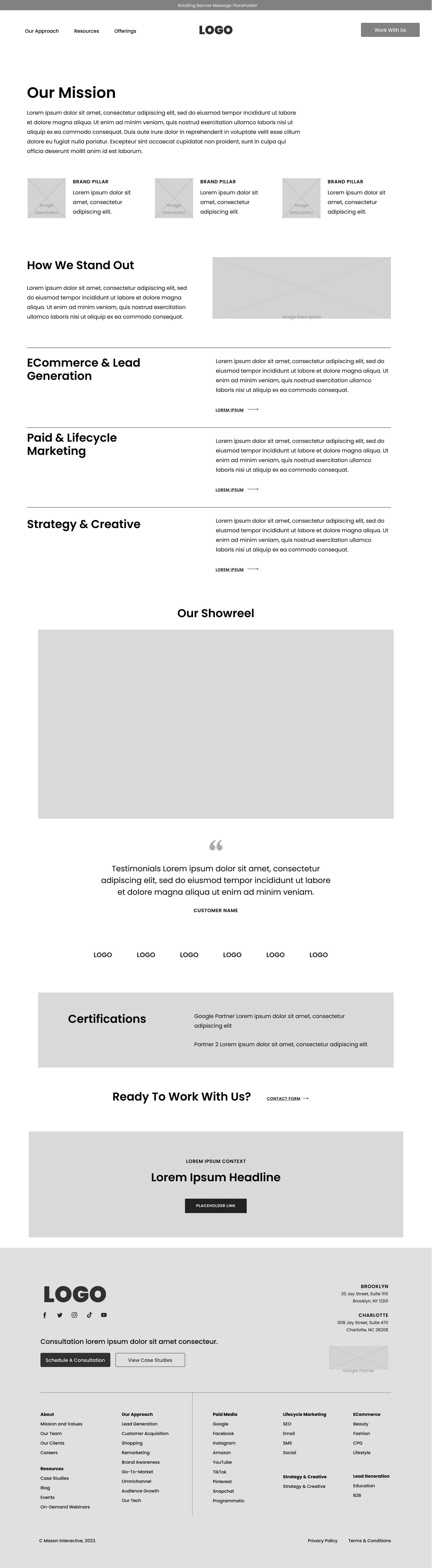
Integrating imagery, iconography, and graphs to break up content-heavy sections
Using collapsible drop-downs and interactive modules to keep pages scannable while still offering depth
These early explorations shaped a more intentional and navigable experience, balancing clarity with depth. With alignment around a cleaner, more user-centric approach, I moved into wireframes to define structure, refine interactions, and lay the foundation for a more engaging, conversion-focused site.
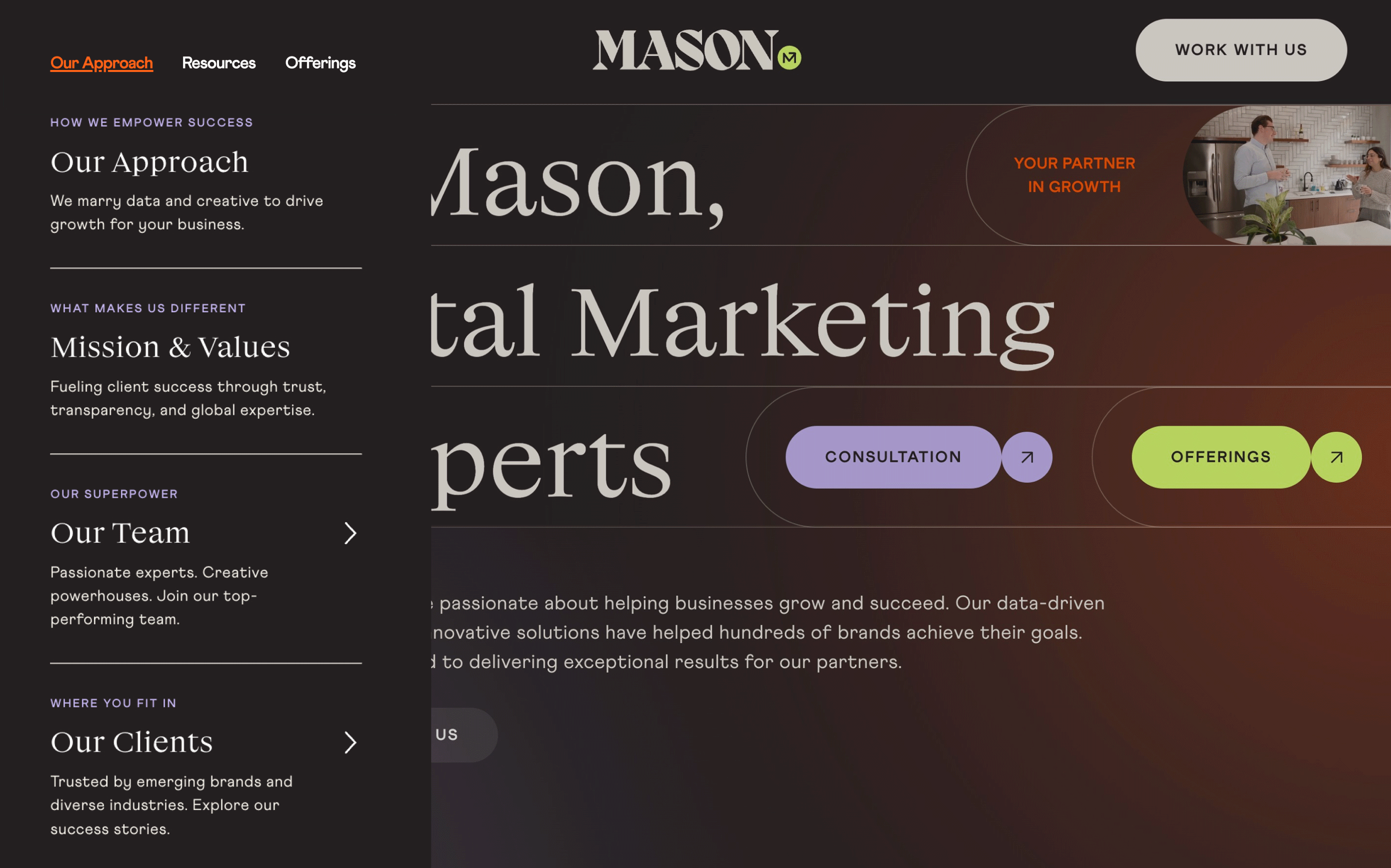
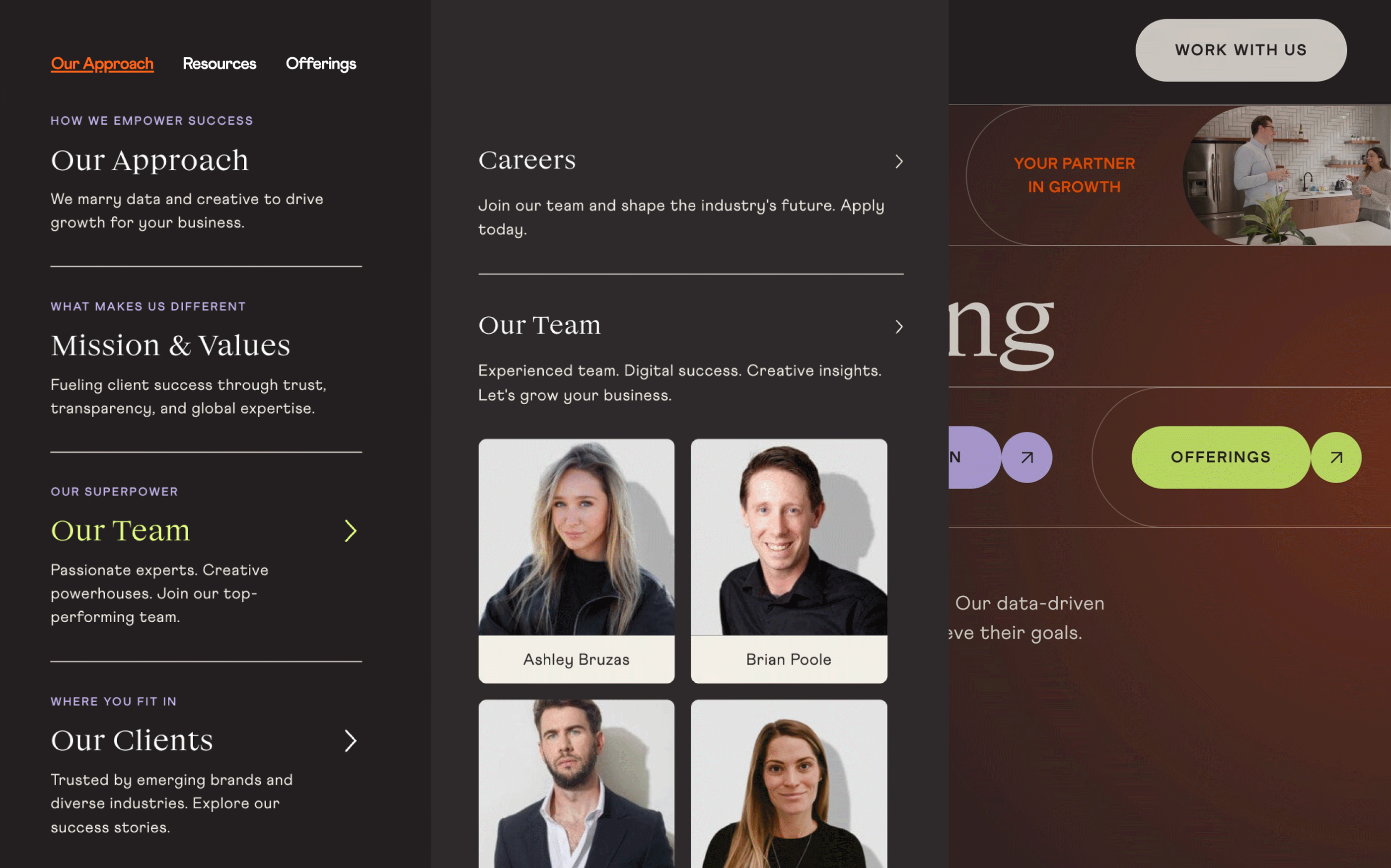
Simplified Navigation with clear CTA
Clarity around services top of homepage
related information grouped toegether
interactive modules break up content
Step 3: Design Execution
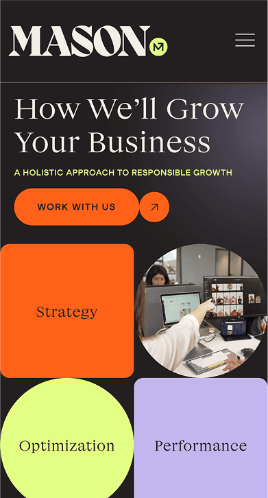
Designing with depth.
To manage Mason’s extensive content without overwhelming users, I implemented the following to reduce visual clutter and establish a more intentional user experience:
Streamlined navigation
A clearer navigation structure made it easier for users to quickly locate the information they needed
Improved readability
Grouping similar content and removing repetition made information easier to navigate
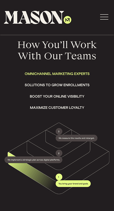
Engaging Content
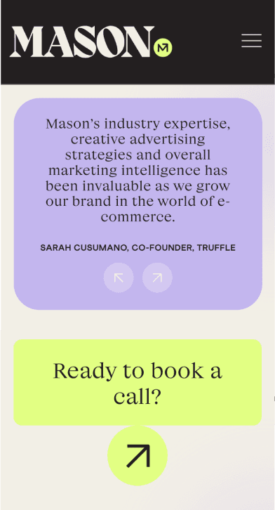
Supporting imagery, iconography, and data visualization broke up dense, info-heavy sections
Decluttered User Journey
Interactive elements like collapsible drop-downs, tabs, and animations helped minimize visual fatigue
Streamlined navigation with a flyout menu
Additional flyout menus for deeper links


Impact
Boosting leads and clarity.
The redesigned Mason website significantly improved user experience with a restructured navigation and clarified content, resulting in a smoother path to key information and clear calls-to-action. Since relaunch, the site has driven increased lead generation and client inquiries, reflecting better user engagement and clearer messaging. Internal feedback highlighted reduced user confusion and improved content accessibility, helping Mason better showcase its expertise and convert visitors into clients.