The Challenge
With years of experience in the marketing and advertising field, Mason was ready for a website that was more representative of the agency’s expertise, and a restructured and uncluttered website that would house all the current content and generate new leads.
The Solution
Joining the project midway, I took the lead starting from the wireframe phase, with a focus on guiding users toward key content that would drive lead generation. I structured each page to streamline dense, copy-heavy sections, ensuring clarity and flow, and incorporated clear calls to action at the bottom of every page. Since the launch of the new dark-mode site, Mason has seen a noticeable increase in lead generation and client acquisition.
The Process
Phase 1: Onboarding + Project Transfer
Phase 2: Wireframing + Prototyping
Phase 3: Designs + Developer Handoff
Phase 1
Onboarding + Project Transfer
Onboarding
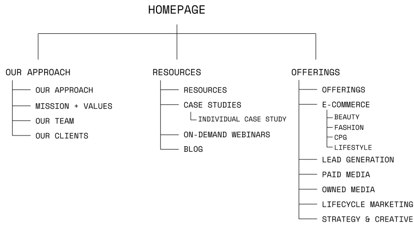
Brought into the project partway through, I worked closely with my manager to get up to speed and ensure consistency with the client’s previously approved sitemap and user flows.
Project Transfer
Stepping in to lead the project from the wireframe stage, I took ownership of the whole project—presenting key design decisions, facilitating feedback, and ensuring alignment throughout the process to maintain a clear, collaborative workflow.

Founder
E-commerce director
Data-Driven performance
Performance Marketing
Personalized Results
Phase 2
Wireframing + Prototyping
Wireframing
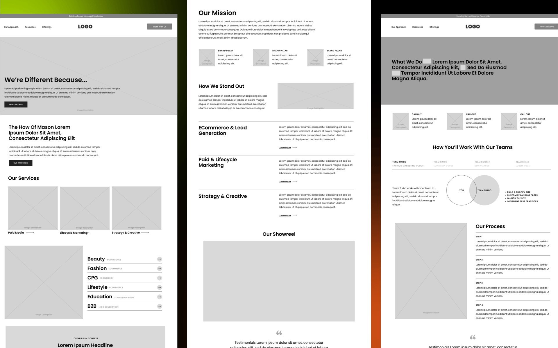
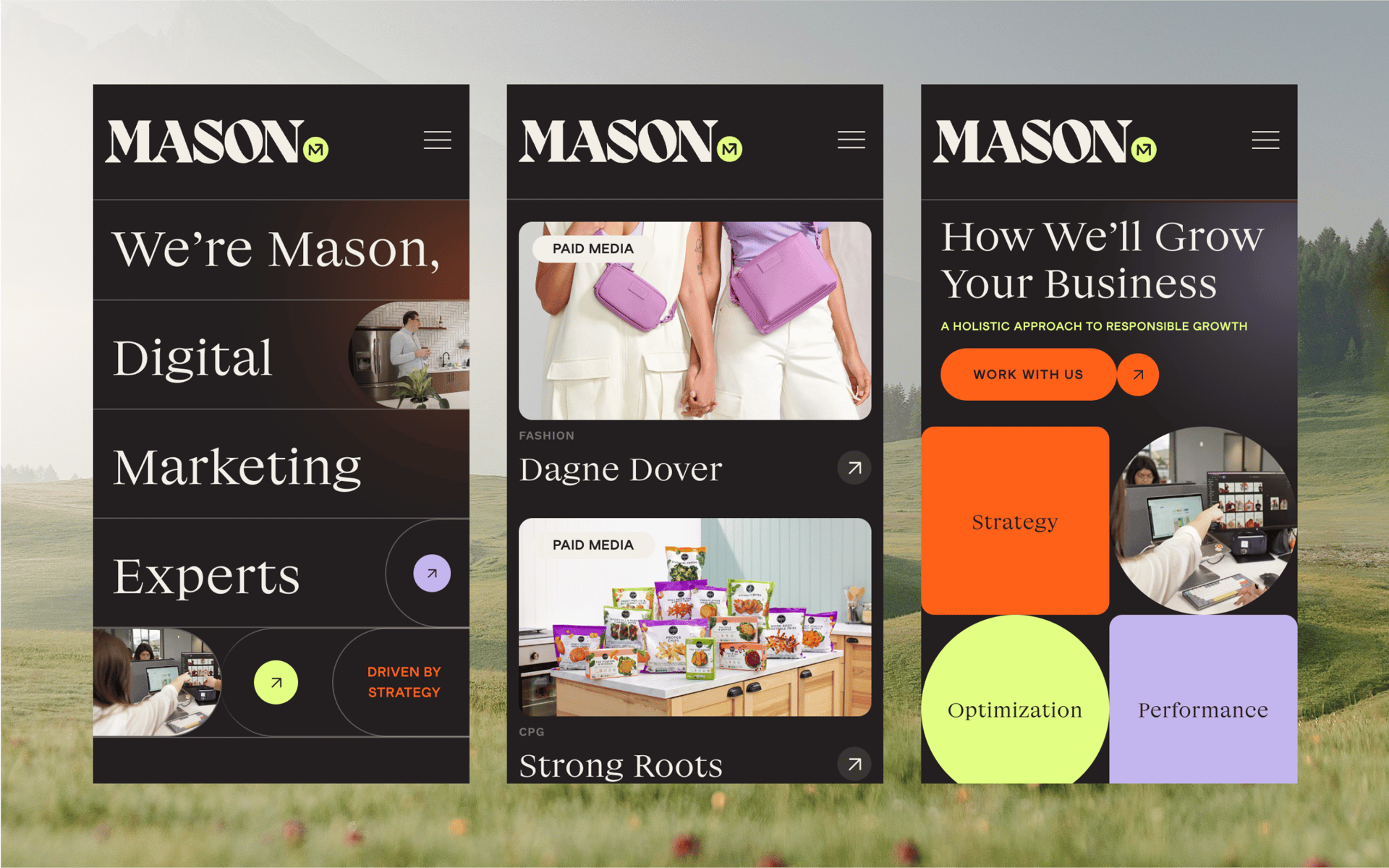
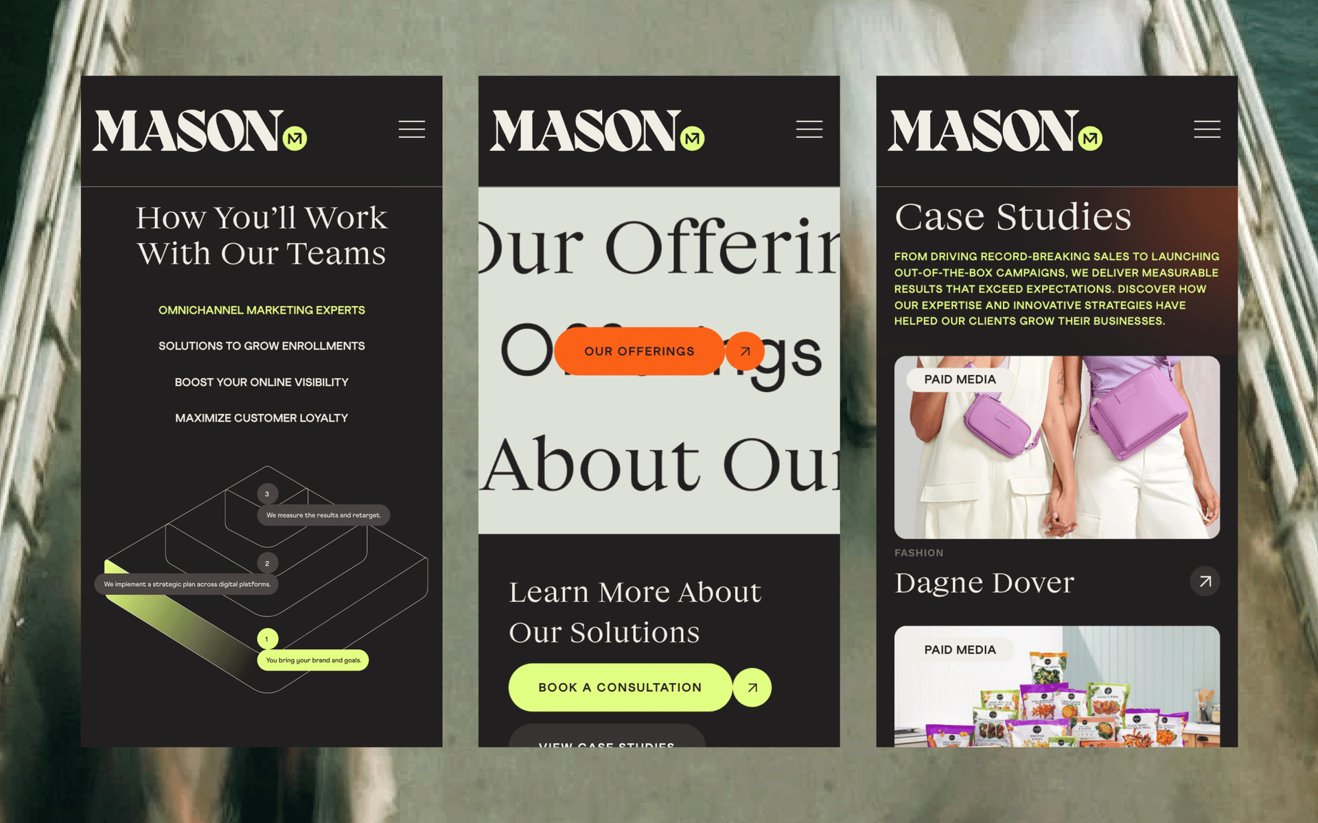
To manage the brand’s extensive content without overwhelming users, I consolidated related information, incorporated graphs, and introduced expandable dropdowns along with high-level callouts for easy scanning. This helped reduce visual clutter while also creating a cleaner, more focused user flow and experience.
Prototyping
To bring the user journey to life and build a shared vision, I created interactive prototypes featuring click-throughs and animations, and walked the client through the features. This helped illustrate key interactions early on, ensured alignment on direction, and laid the groundwork for a smooth transition into high-fidelity design.
Phase 3
Designs + Developer Handoff
Designs
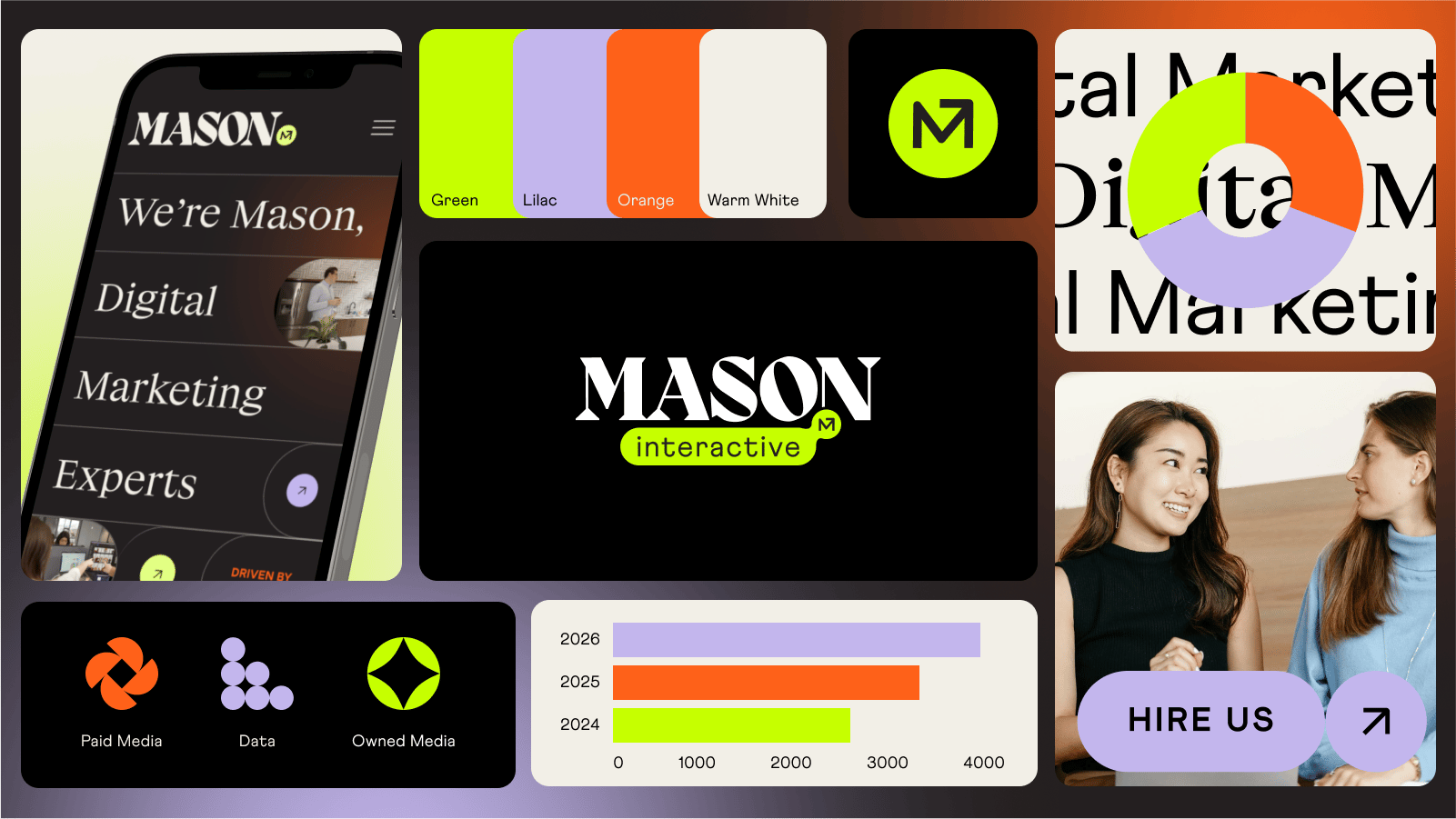
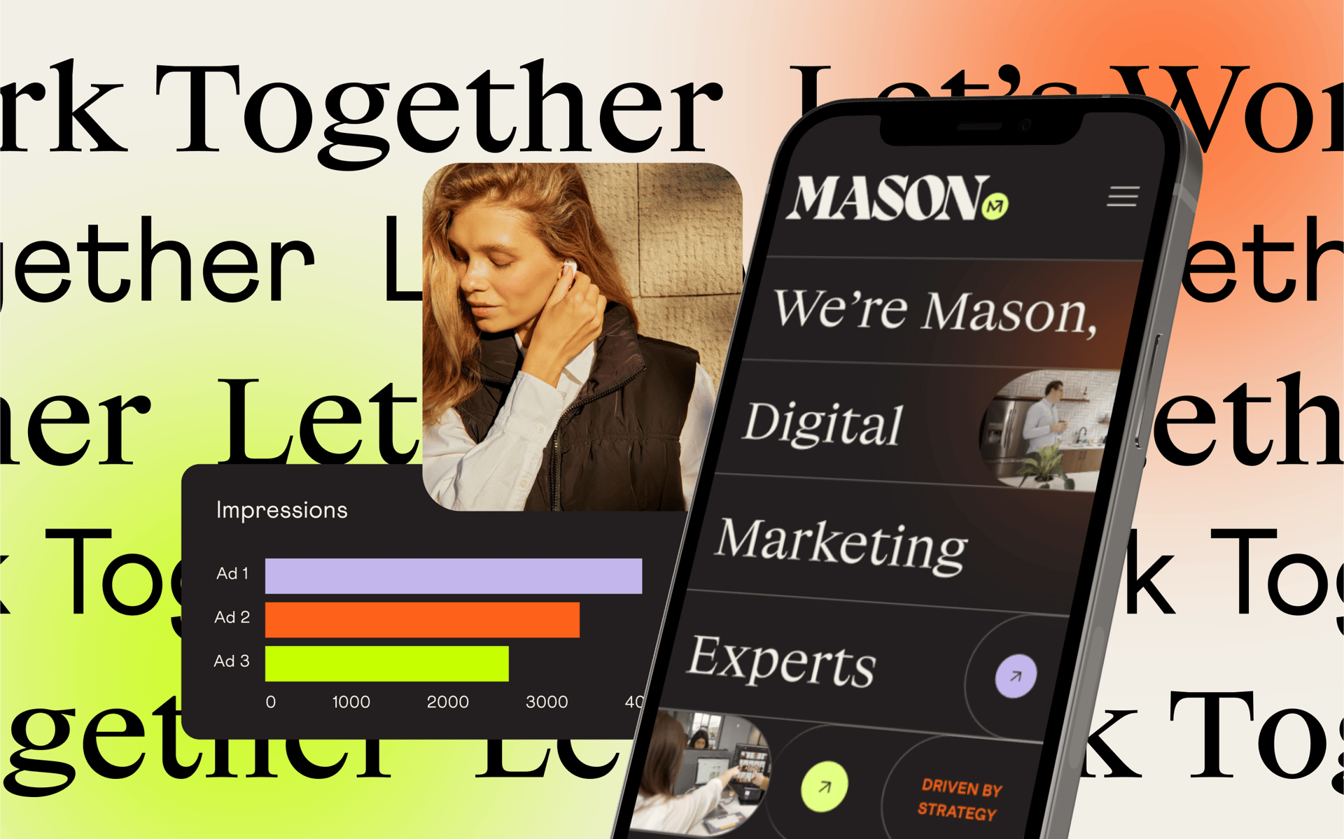
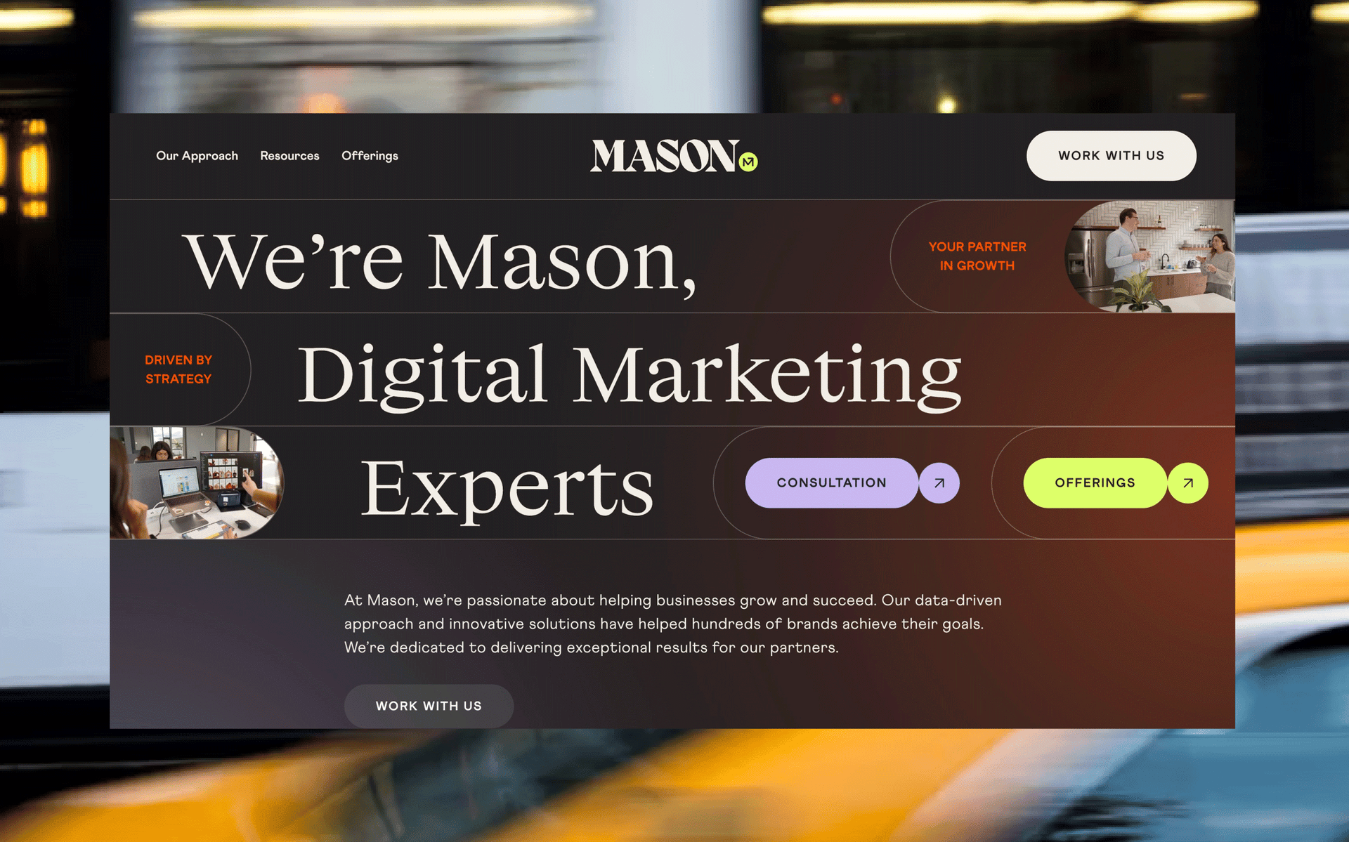
Setting the brand visually apart from the typical sterile, white-based aesthetic of competitors, I chose a dark mode design to create a premium, forward-thinking feel that reflected the brand's focus on innovation and technology. To add energy and visual interest, I layered subtle pops of diffused color on top of the background and brought in large, editorial-style serif headlines to add a bold, elevated feel, while a friendly, playful sans serif for body text balanced the layout with approachability and warmth—striking a unique blend of expertise and approachability.
Developer Handoff
Upon the client's approval of final designs, I transitioned into staging with an external development team. To support a smooth handoff, I prepared a comprehensive package that included annotated design files and a detailed style guide. I held multiple walkthroughs with the developers to align on visual details and micro-animations. Once the site was staged, I led an initial round of quality assurance and collaborated closely with the development team to ensure accurate execution ahead of the final delivery to the client.
Final Thoughts
Taking over from the wireframe stage, I focused on creating a streamlined, content-driven experience that guided users toward key information and clear calls to action—ultimately supporting Mason’s lead generation goals. By simplifying dense content and introducing a bold dark-mode aesthetic, the redesign not only elevated the brand’s digital presence but also delivered measurable results, with a marked increase in qualified leads and new client conversions. This project highlights my ability to step in midway, bring clarity to complex content, and design with both impact and outcomes in mind.
Next
Prev

